Project:
Web Design
5 weeks
Role:
Researcher & UI/UX Designer
Project Overview:
Background
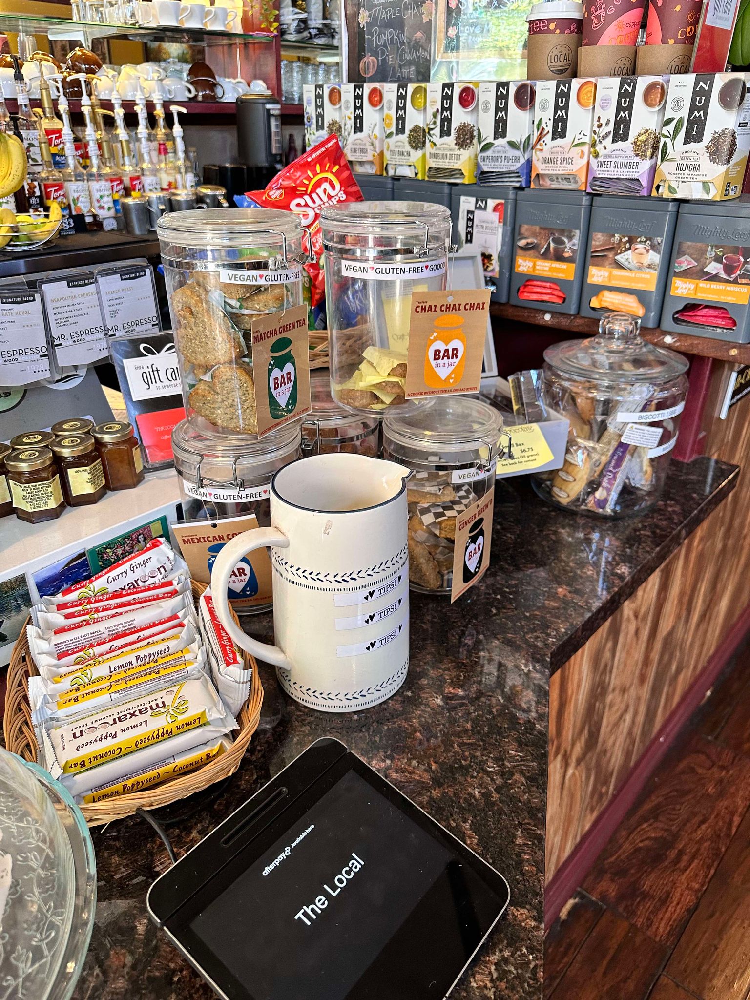
The Local specializes in hand-crafted pour-over coffees, espresso drinks, and tea, complemented by a curated food menu. Established in 2017, it has been a coffee house for over 20 years and is one of the oldest buildings on Park Street. The Local occasionally hosts events and live music, making it an ideal spot for socializing or working with fast Wi-Fi. The owners are dedicated to maintaining a community atmosphere and continuing the tradition of small-business coffee in Alameda.
The Problem
The Local is a small café centered in downtown Alameda. They have various media pages such as Facebook, Yelp, and Twitter but they are missing a main website where all this information is centered. Which may result in the business missing out on valuable opportunities and customers.
Solution
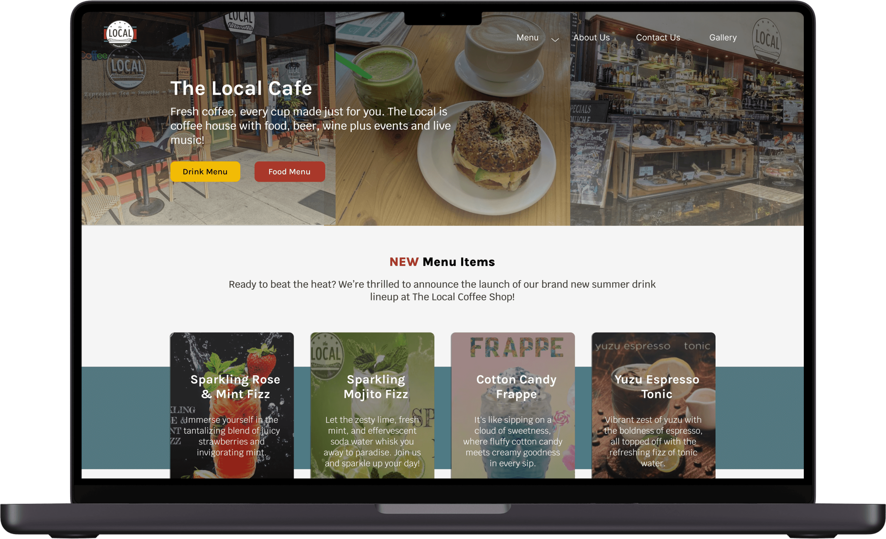
Designing a website to centralize all of The Local’s information in one place. Showcasing more of the cafe’s personality to attract new customers into visiting the cafe for themselves. While implementing any new features the cafe owner may want.
Design Process
Discover - First Steps
Research Goals
Learn what information is necessary for a local business’ website to properly advertise and attract customers.
Learn what customers look for when deciding to visit a café/restaurant and also what deters them from one.
See if the goals of business owners and the goals of customers align with one another.
How will we get there??
Competitor analysis, field observation, and user interviews
Competitor Analysis
To begin my research, I decided to look towards neighboring cafés in the area. Taking note of how they utilized their branding and displayed information on their websites.
I found that the majority of local cafés have a minimal UI with their most important information on their homepage. It was interesting to see what each café prioritized.
Field Observation
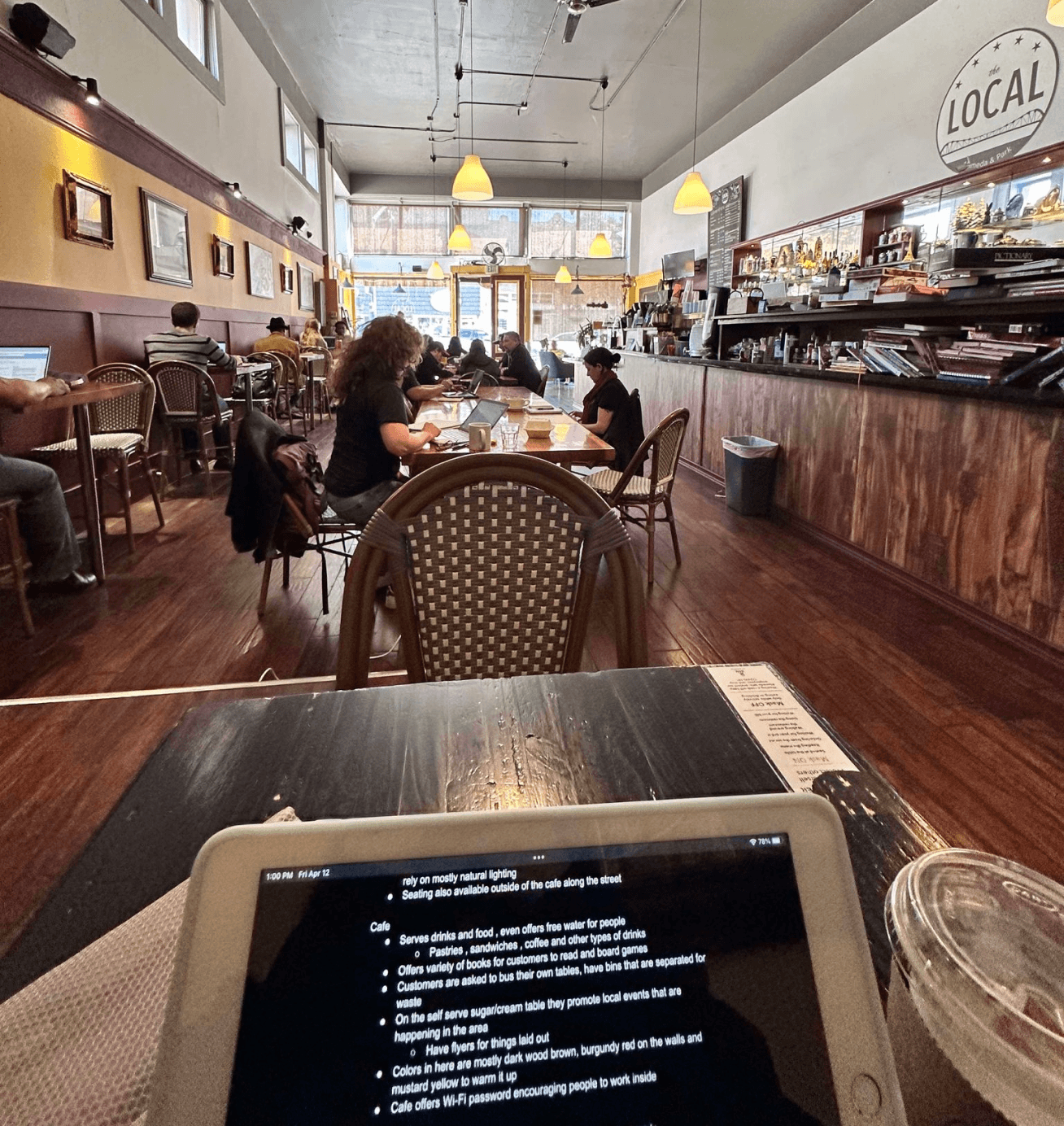
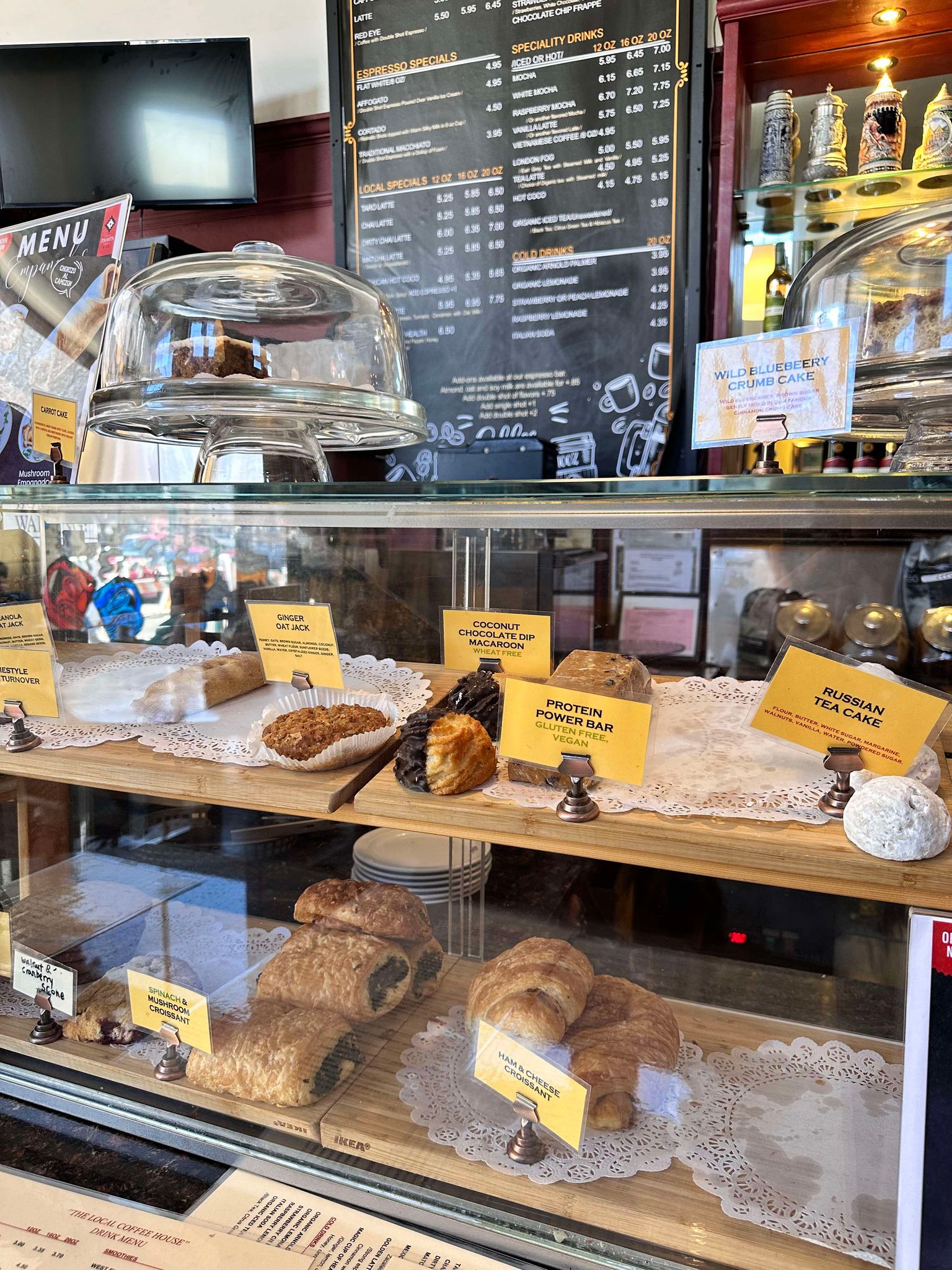
I went in to observe customers at The Local and stayed for roughly 50 minutes. My goal was to identify any pain points, understand customer behavior, customer demographic, and gather insights on the general vibe of the café. I recorded notes, hoping to encapsulate the café’s personality into the project.
Some Notes:
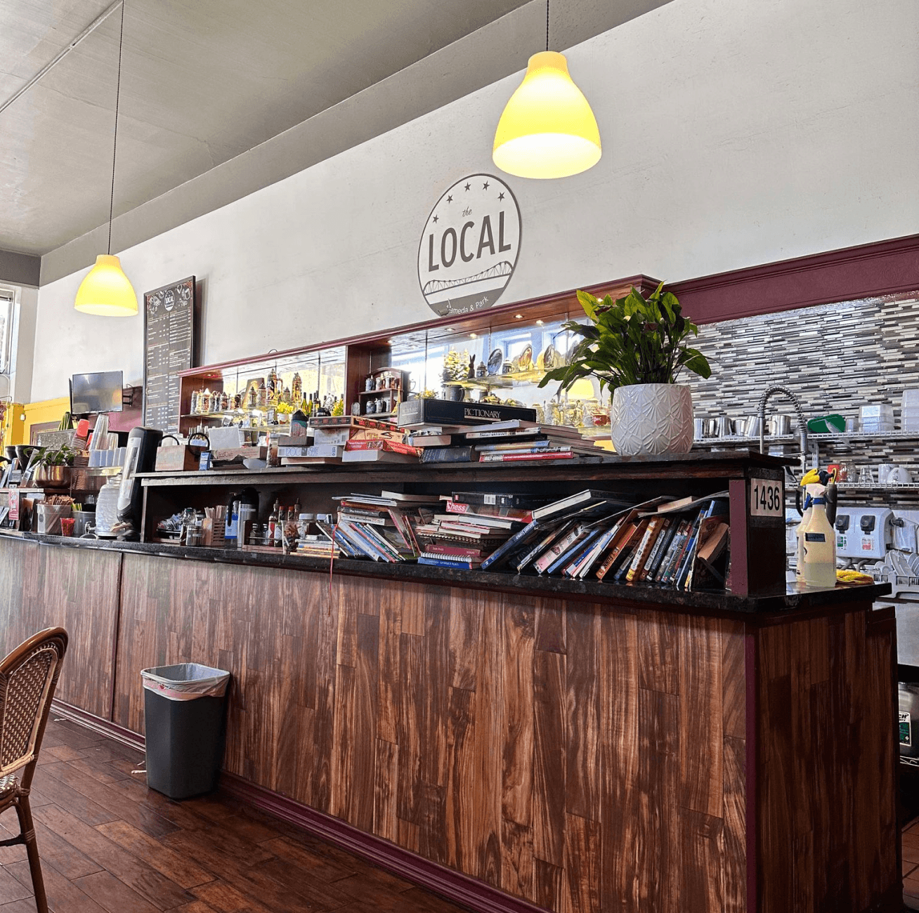
The cafe is very spacious, offering plenty of seating both indoors and outdoors
Majority of people were on an electronic device, ~2 people reading books
The café encourages customers to stay, providing games to play and books to read
Advertises events happening in the community
User Interviews
I conducted user interviews with five participants over Zoom and asked them about their personal café experiences: whether they enjoy going to cafés, how frequently they go, and why they go to specific places over another. Next, directing the conversation to asking what they look for when on a cafe’s website or menu.
Sorting Through the Data
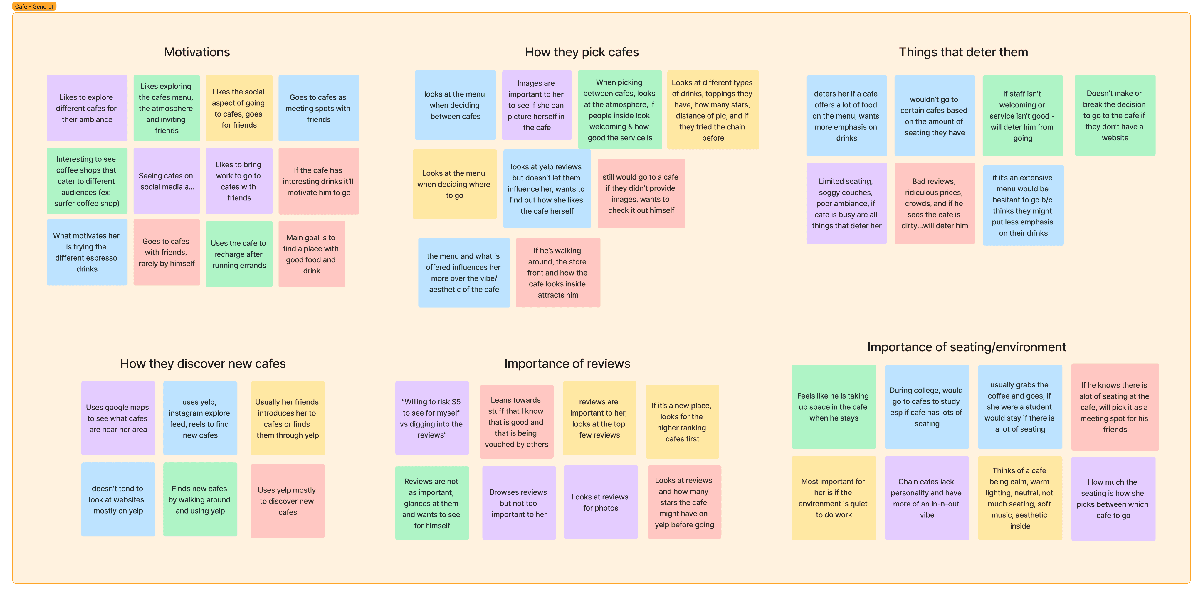
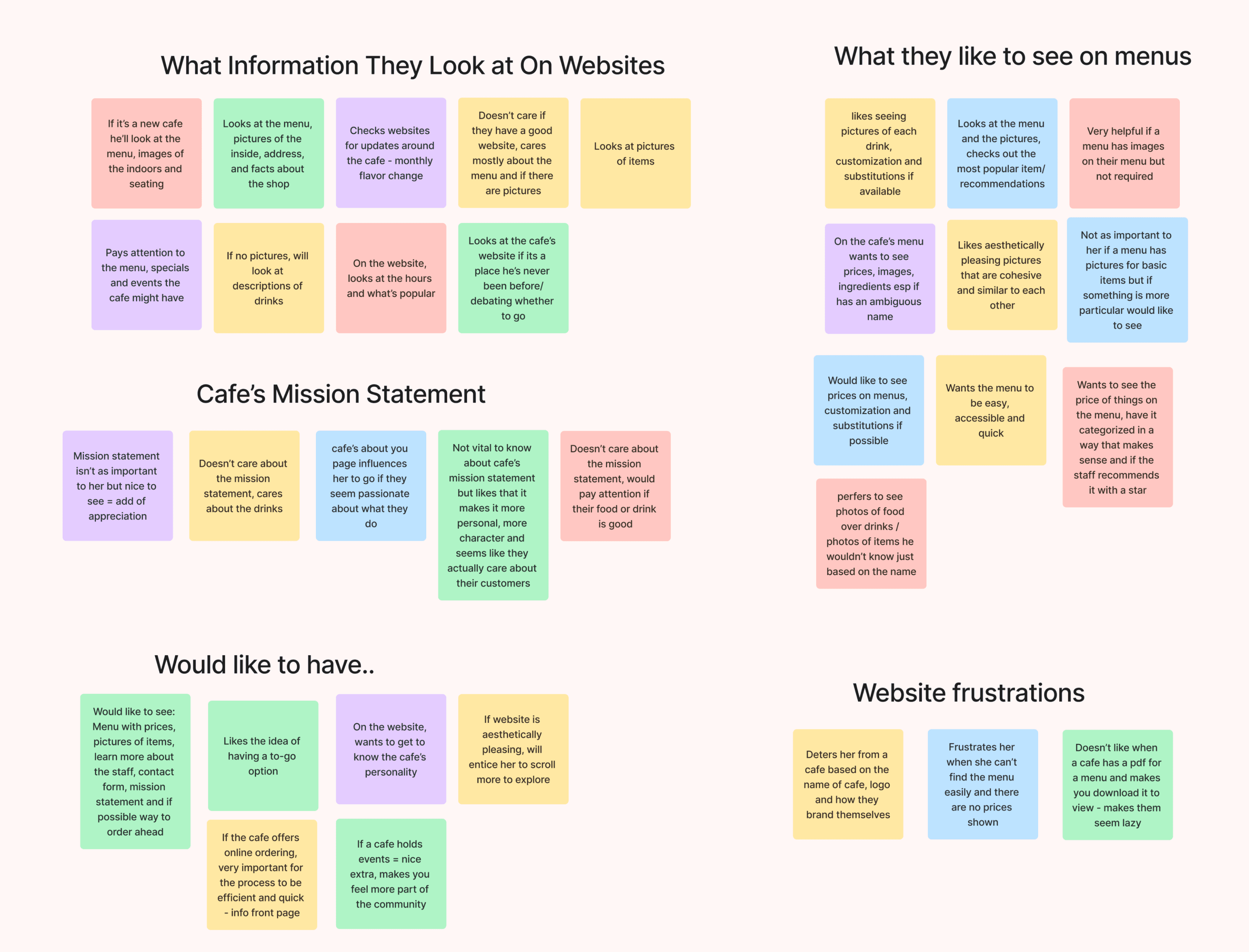
Using an affinity map to categorize the data was extremely helpful for visualizing common trends among the participants. By laying out their behaviors and preferences, I was able to identify key areas to focus on for my café web design.
Seating is very important to customers. The more seats a café has, the more likely they are willing to stay and work or socialize with friends
Participants' motivations for visiting a café fell into three main categories: socializing, food and drink, and the café's ambiance
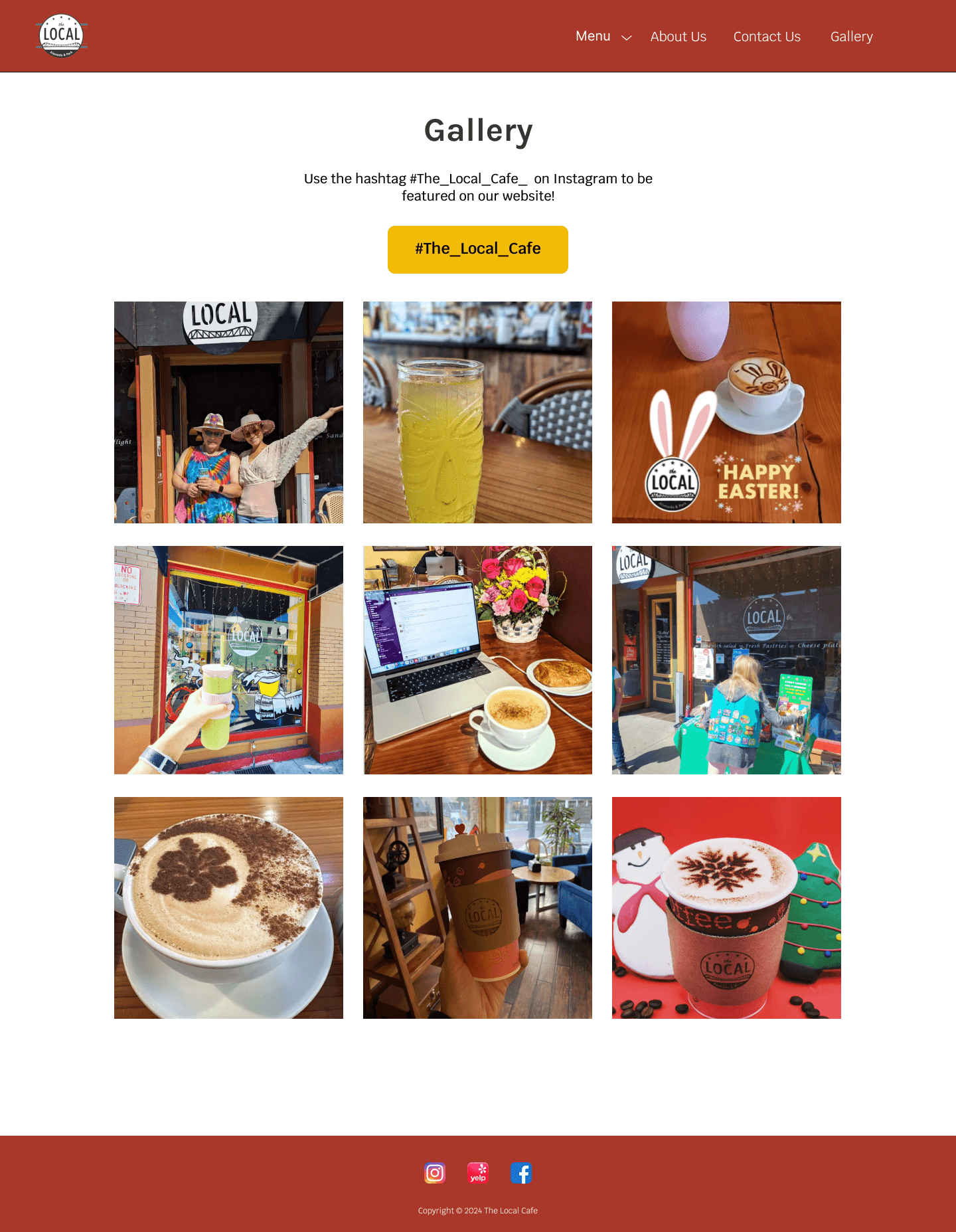
Images were crucial for users, not just for menu items but also for showcasing the café's interior design and seating
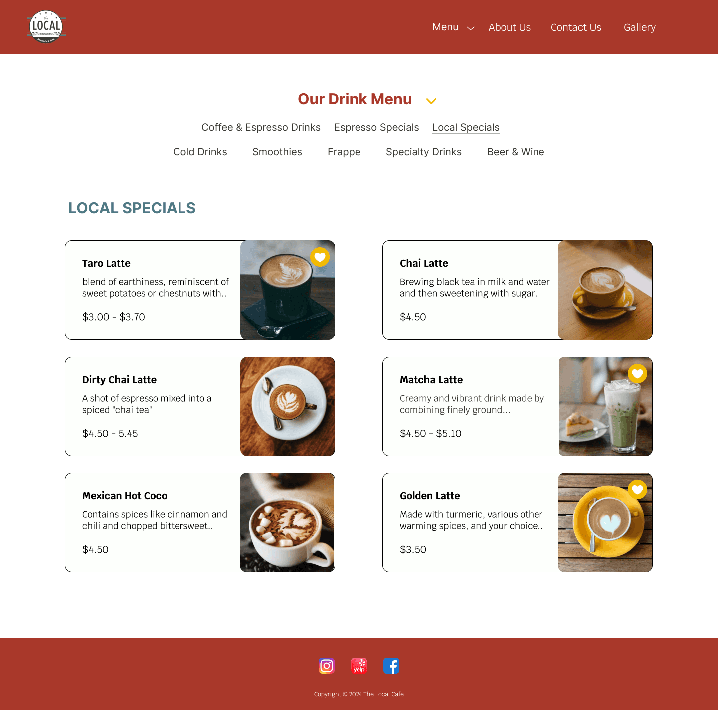
Users preferred seeing images on the menu and wanted to know if items could be customized when applicable
Surprising Findings
I was surprised to find that reviews were not as important to users as I had expected. Many participants were not deterred by negative reviews and preferred to form their own opinions about the café. Additionally, the aesthetics and atmosphere of a café significantly influenced their decision to visit.
User Personas
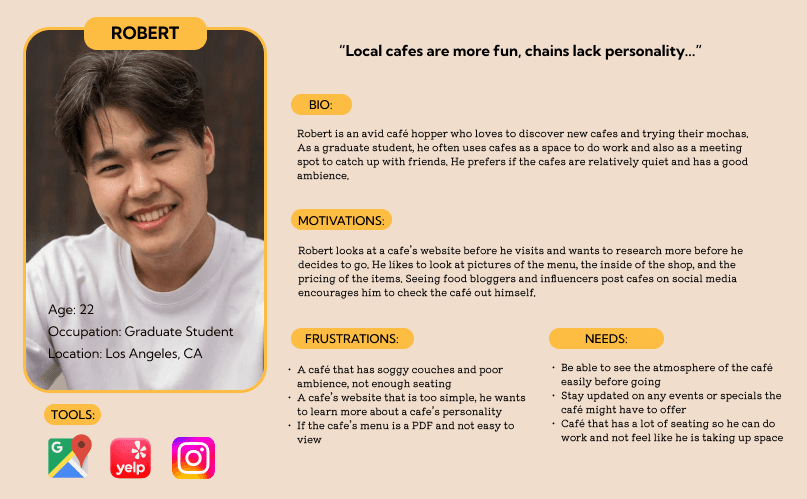
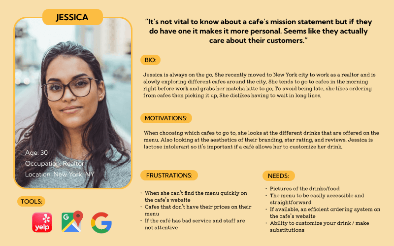
To guide my design choices, I envisioned various scenarios in which users might visit a cafe and created two contrasting personas. This approach highlights the differing priorities and preferences that customers might have. Introducing our personas...
Robert, cafe frequenter and student who likes using cafe spaces to study
Jessica, constantly on the go but has just the right amount of time for a matcha
Ideation
HMW & POVs
Writing How Might We questions (HMW) and Point of View statements (POVs) helped focus my brainstorming, ensuring that my proposed solutions addressed my user’s needs.
HMWs
I’d like to explore ways to encourage customers to keep scrolling and learning more about the cafe.
I’d like to explore ways to exhibit the cafe’s personality on their website while emphasizing the significance of community.
I’d like to explore ways to accommodate customers with dietary restrictions and specific preferences to ensure they are receiving attentive care and service.
POVs
How might we inform customers about new menu items, special events, and current promotions to increase foot traffic into the cafe?
How might we personalize the cafe’s website in an aesthetic and functional way that encourages customers to check out the cafe themselves?
How might we inform customers with specific food preferences or restrictions with the options to customize their orders?
Feature Set
Taking my ideas, I wrote out potential features and organized them based on level of priority. Using the research gathered from my interviews, I kept user feedback in mind as I ranked priority.
Must-Have
menu page
photo gallery
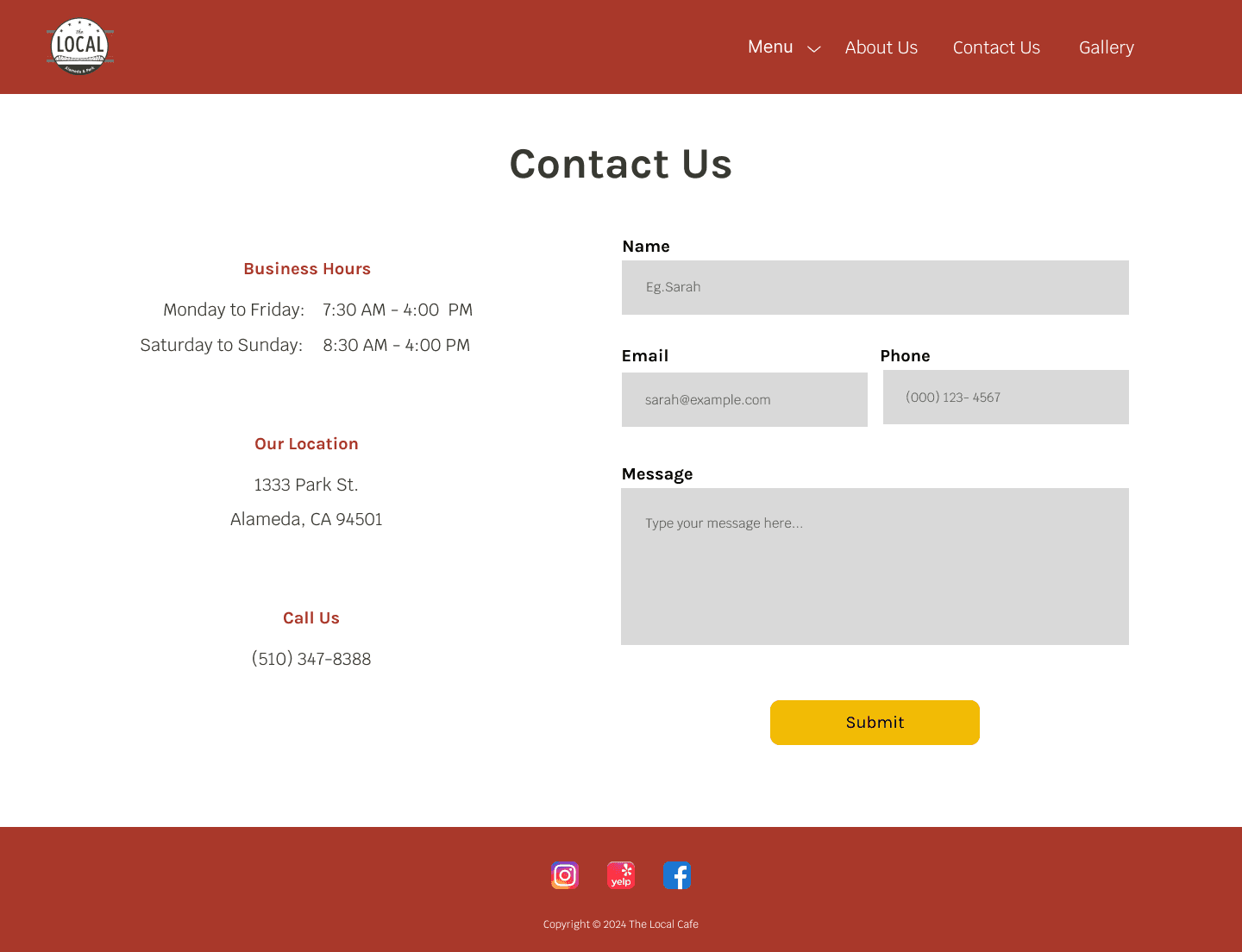
contact info
social media integration
pricing + images
Nice to Have
Can Come Later
ordering to-go option
staff intros
merchandise
gift-cards
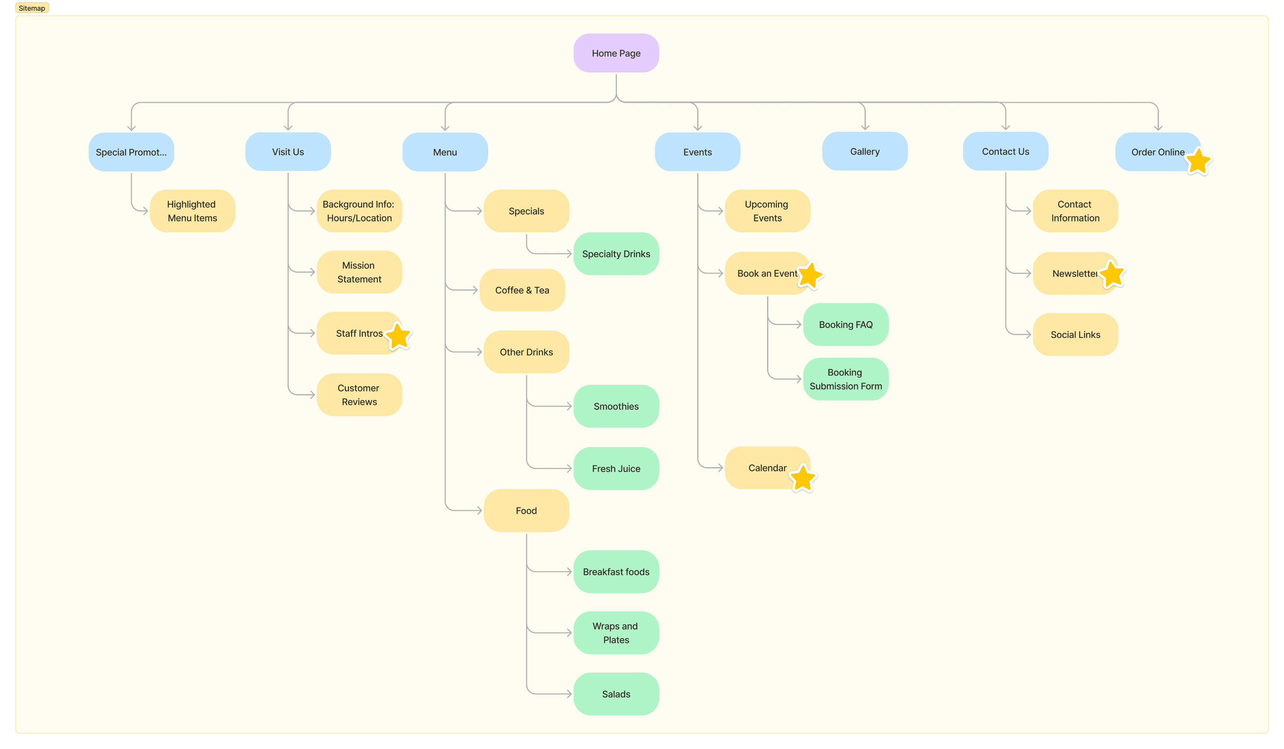
Sitemap
Creating a sitemap was necessary for the navigation of the website. I wanted to make sure navigation was structured in an intuitive and user friendly way. The sitemap includes features that I didn’t end up implementing during this iteration (noted with a star).
Userflow
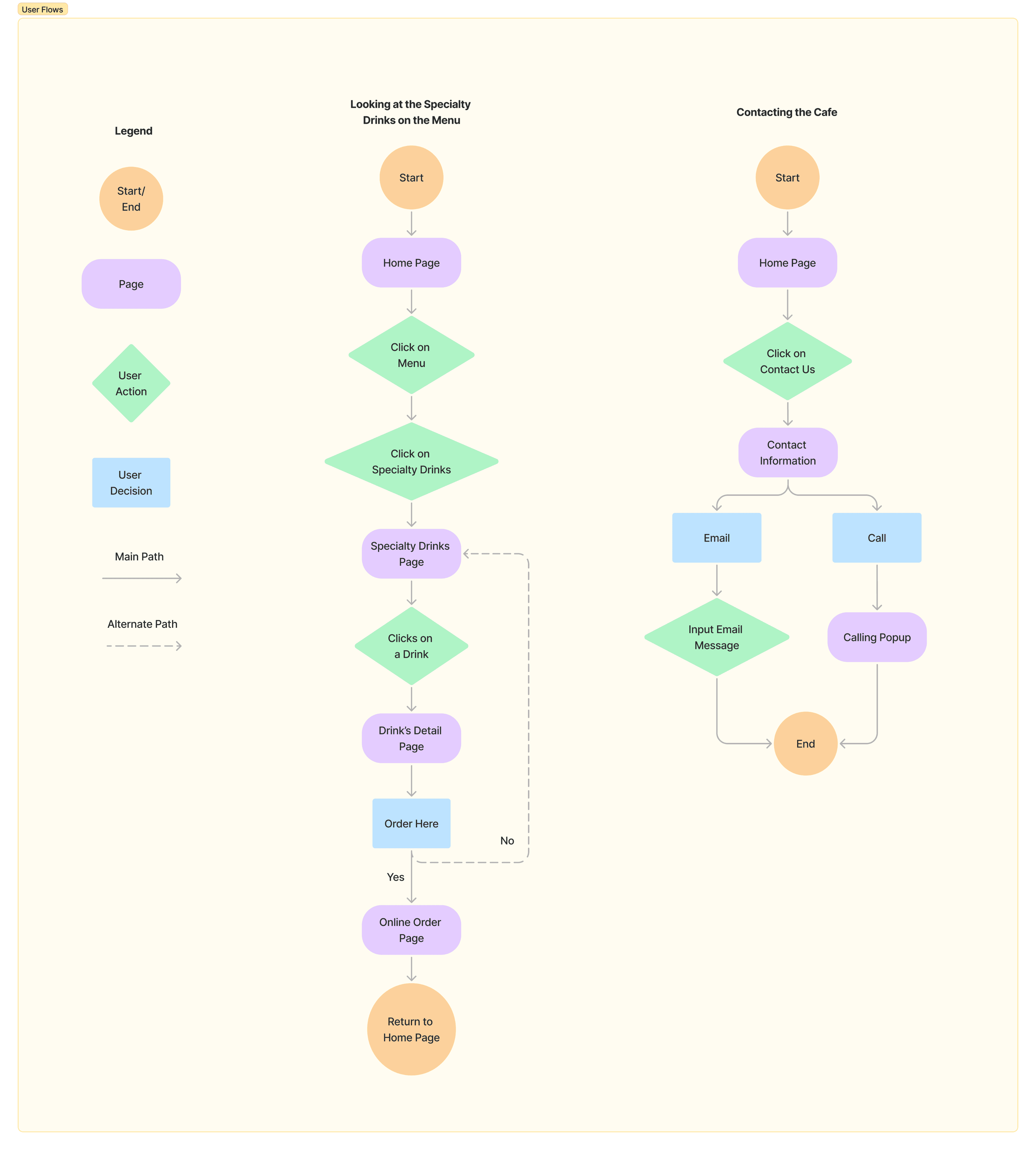
To understand how users would interact with the website, I created two user flows breaking down the steps needed to complete specific actions. This helped visualize the user journey and also identify the screens needed to proceed to useability testing.
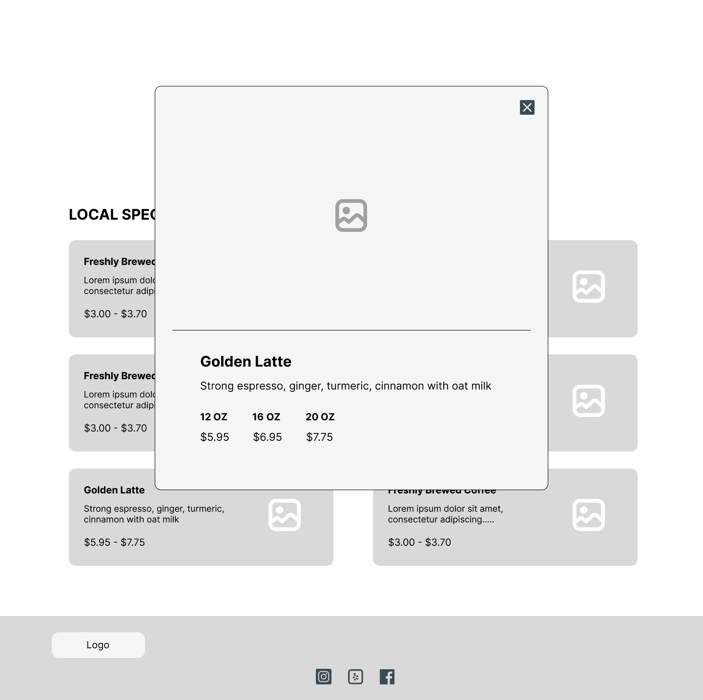
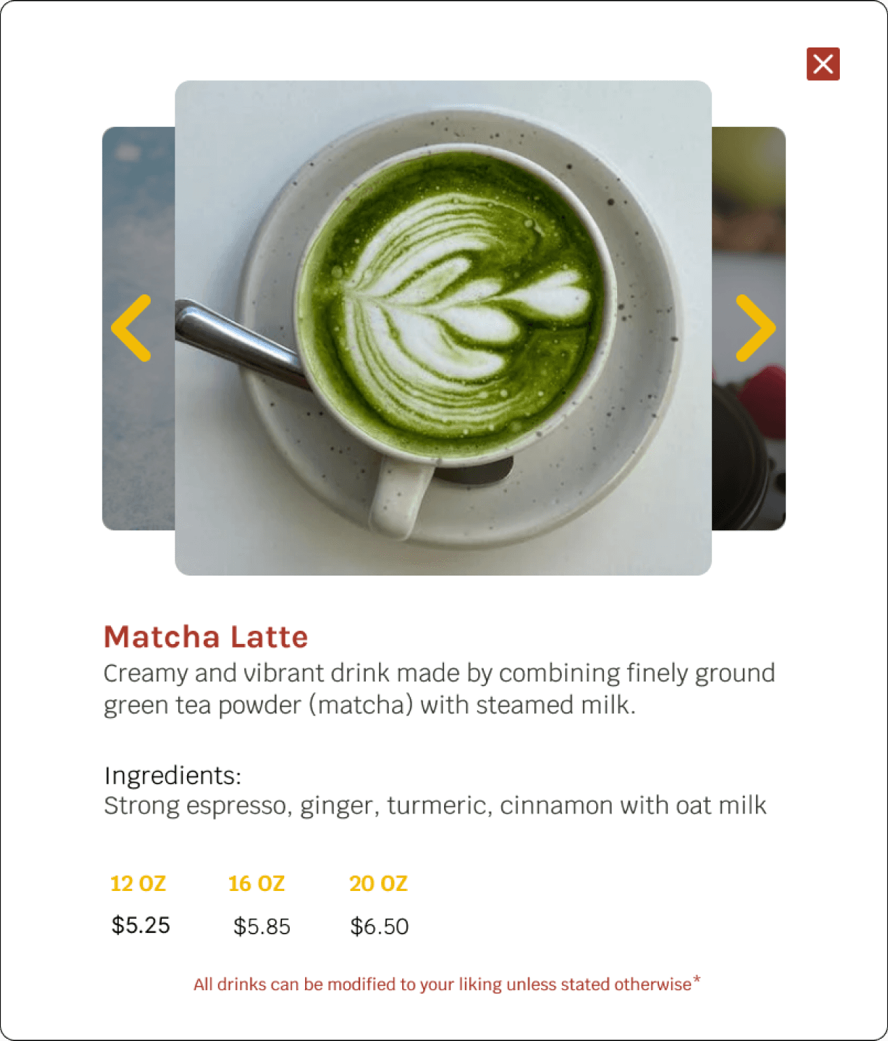
Navigating the menu - description of golden latte
Contacting the cafe
Design
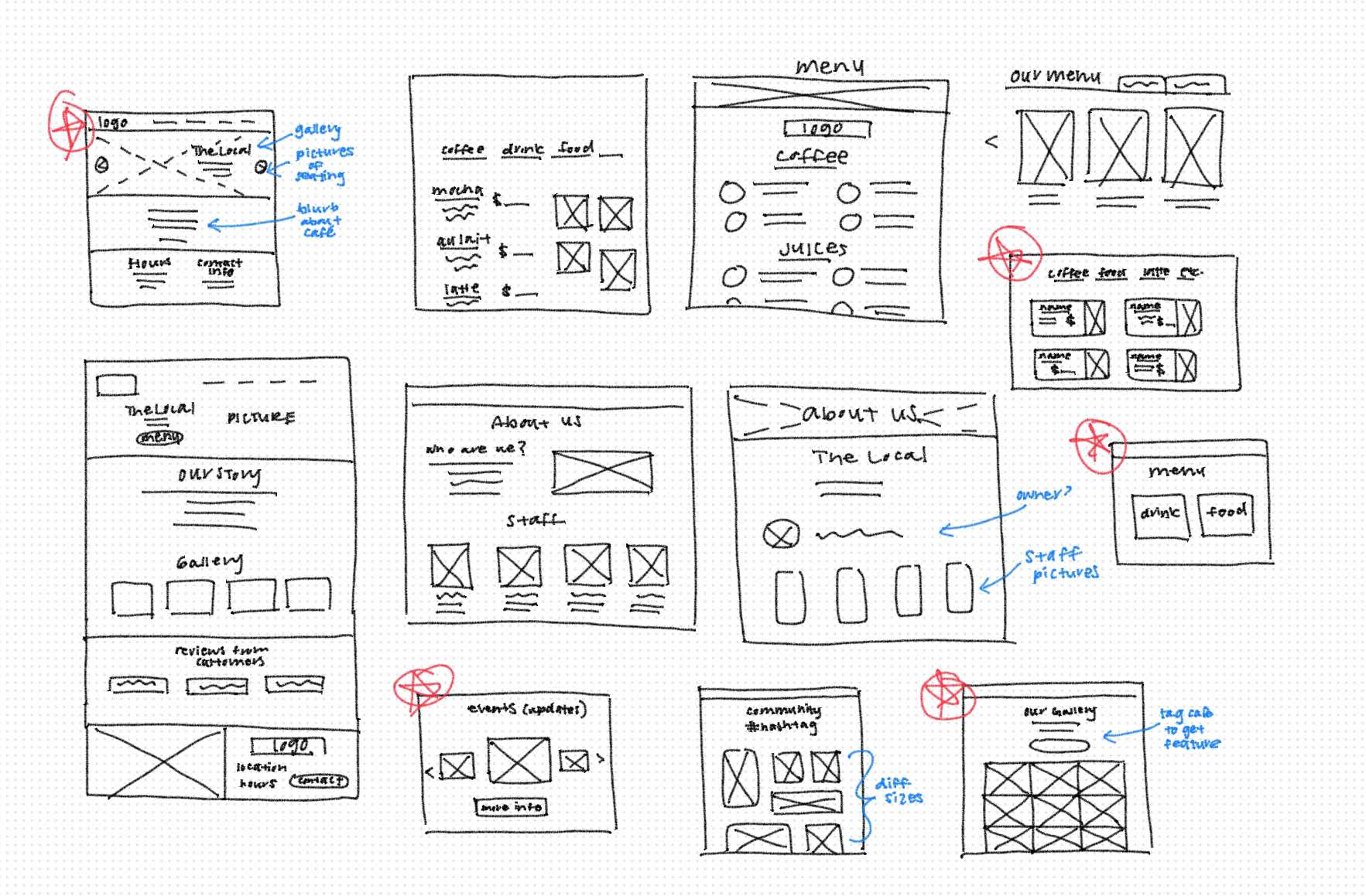
Sketches
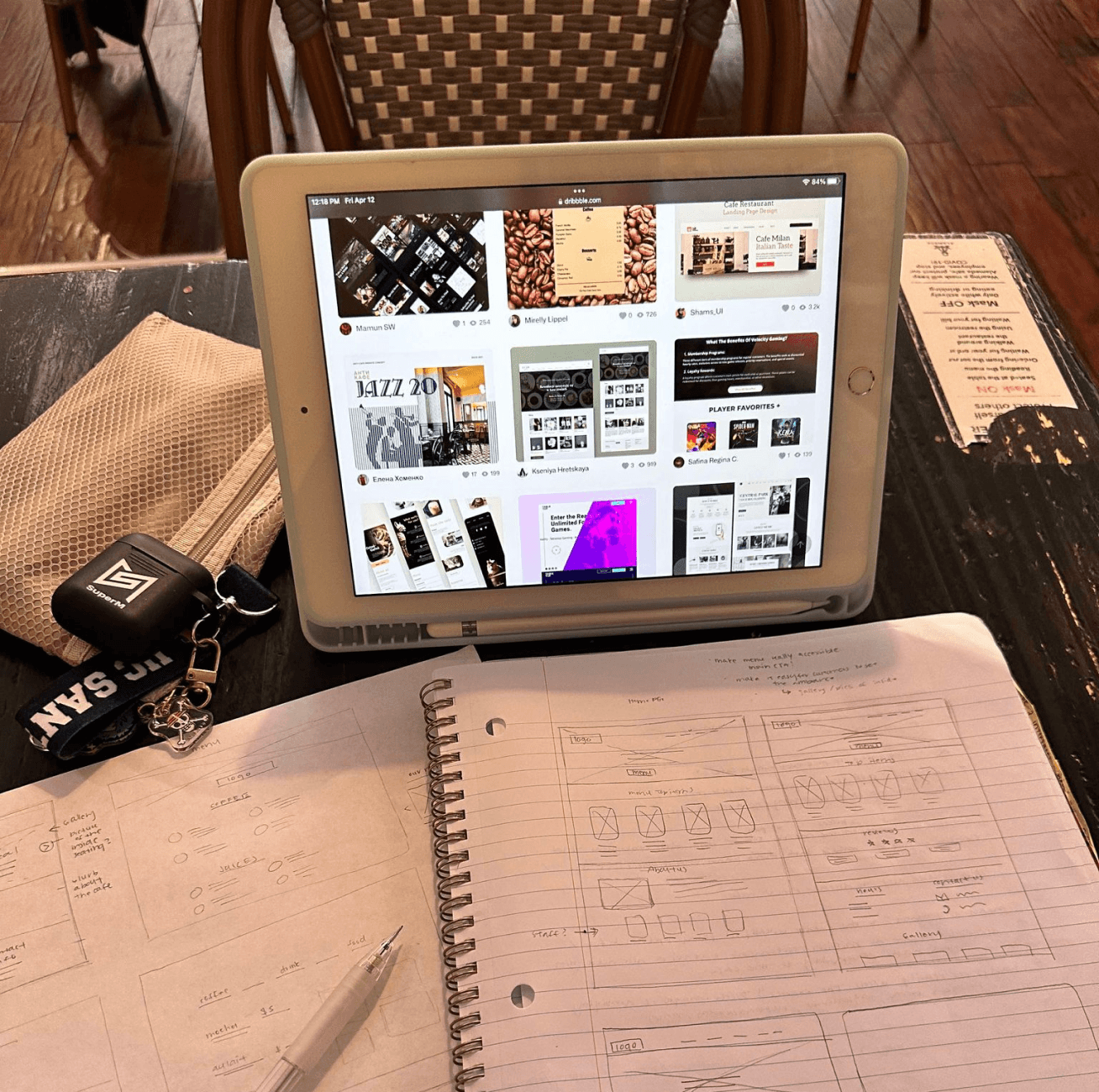
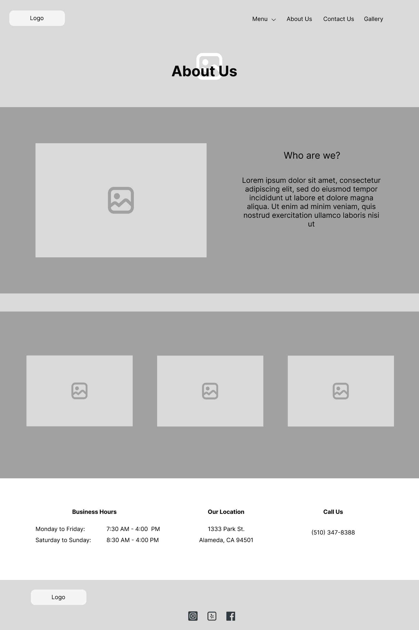
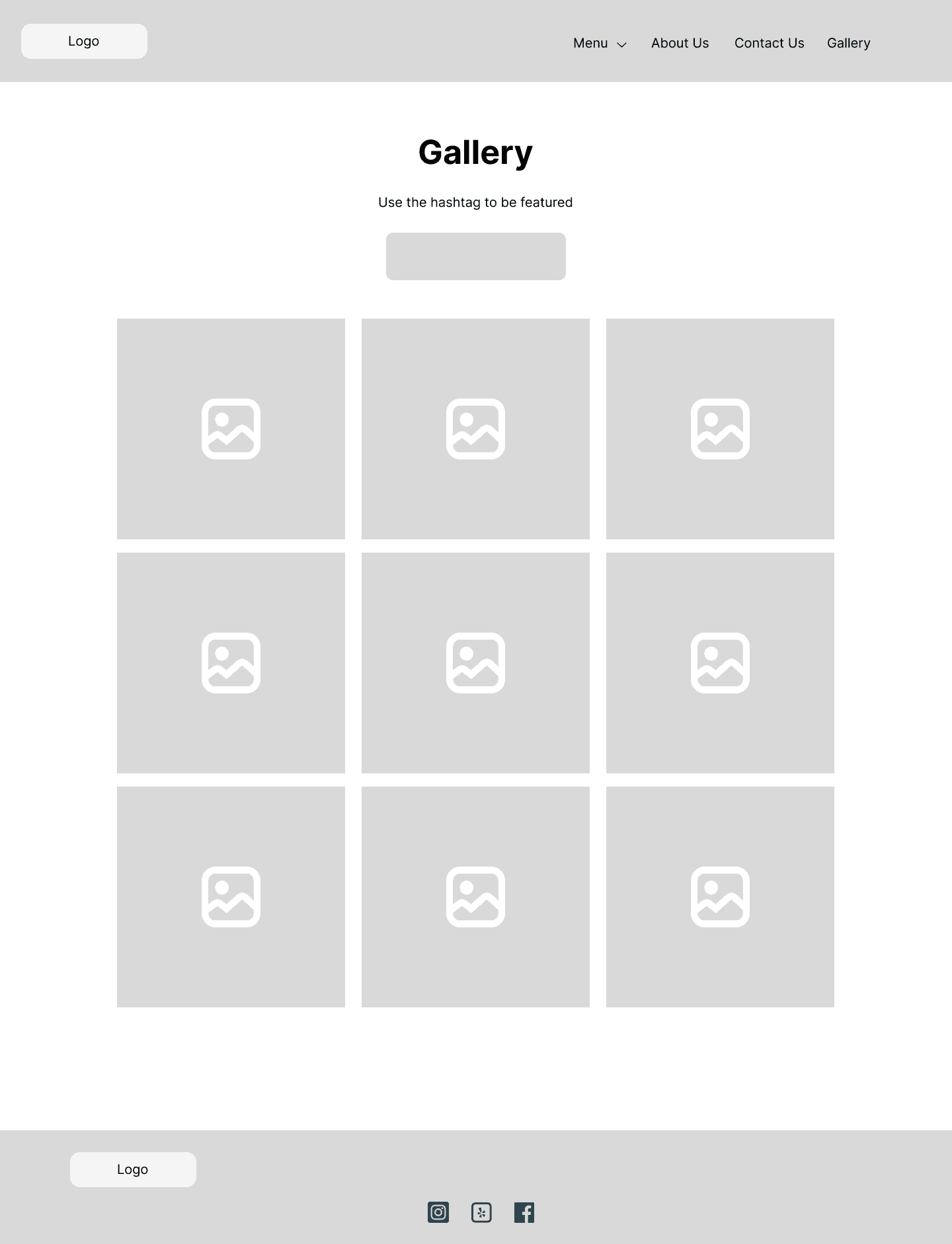
Starting with a rough sketches, I drew multiple key pages, various elements, and wrote down notes. I selected my favorite designs and digitized them in Figma.
Mid-fi Wireframes
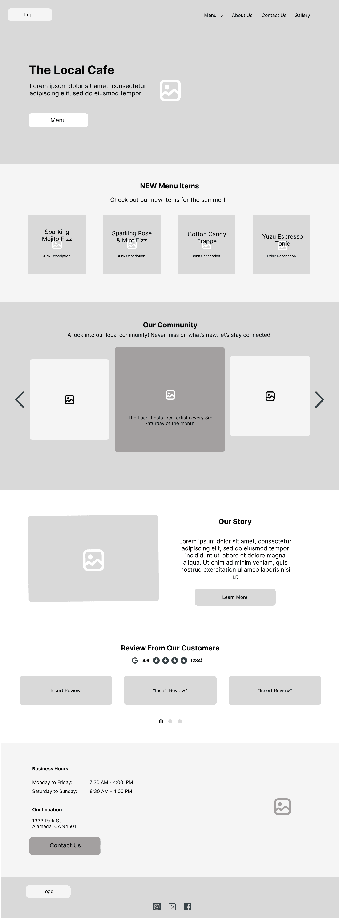
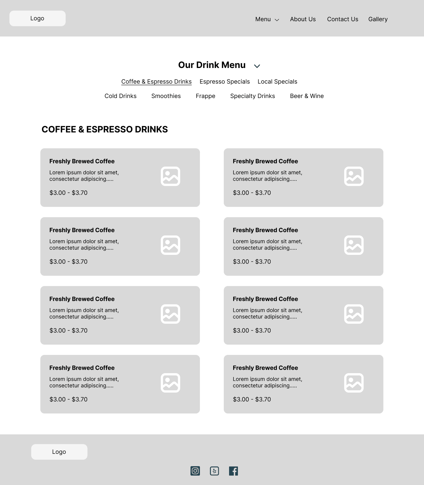
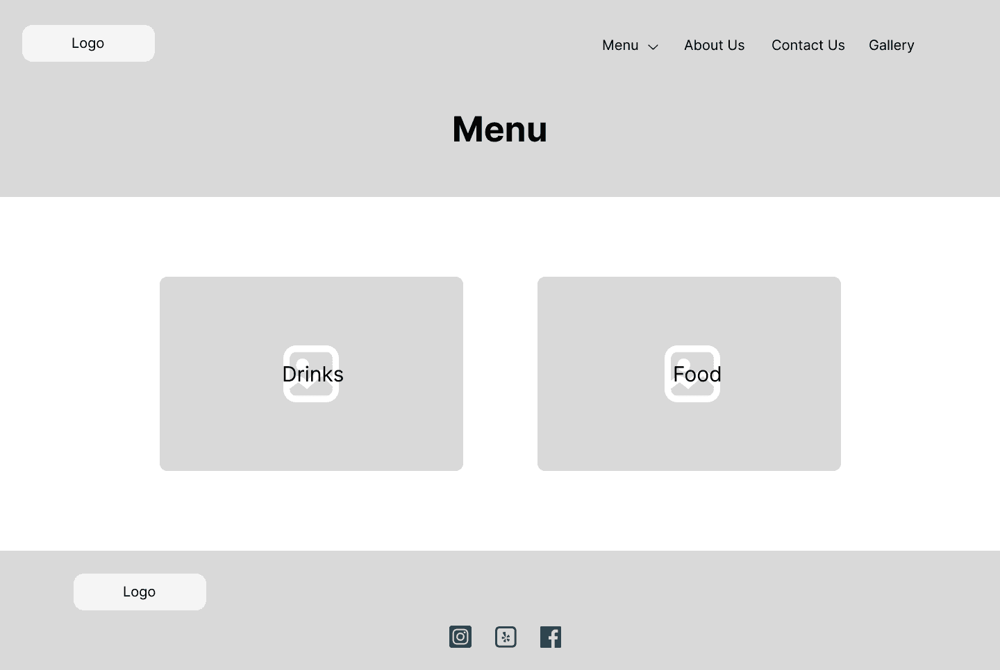
With my digitized wireframes, I created a prototype for usability testing. One screen that I wasn’t 100% satisfied with was the menu categories page. I didn’t like the look of two big buttons occupying the screen and wondered if this page would be useful to users. Could I separate the drink and food menu buttons or maybe combine them?
Testing
Usability Testing
I interviewed five participants, four remotely on Zoom and the one in person. I gave my participants a scenario and had two tasks for them to complete.
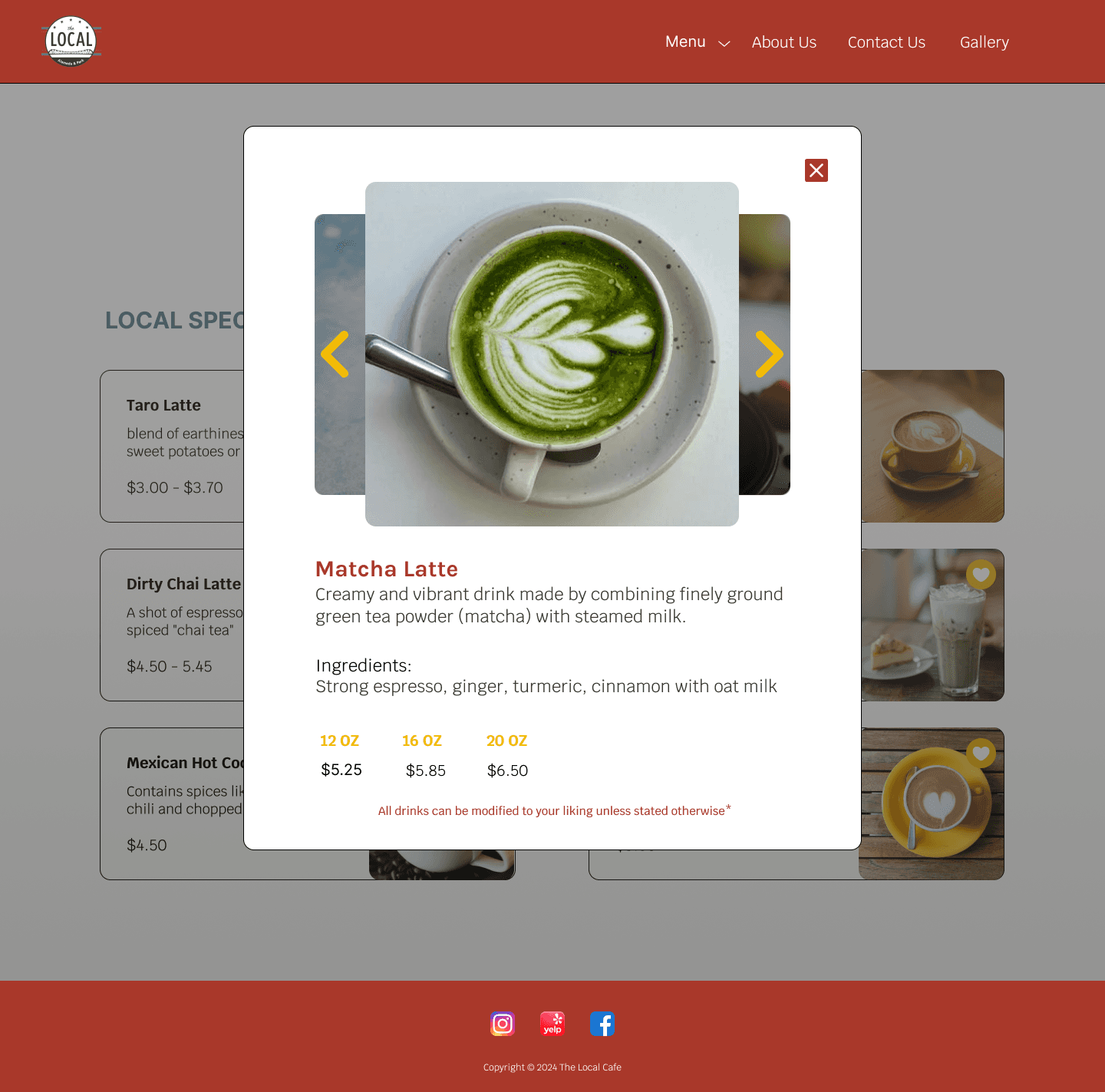
Locate the specialty menu and click on the Golden Latte description
Explore the other pages of the website
Goals:
identify participant’s first impressions of the landing page
pay attention to HOW participants click onto the menu page
identify any parts of the webpage that could be redesigned or changed
Findings:
Hi-fi Wireframes
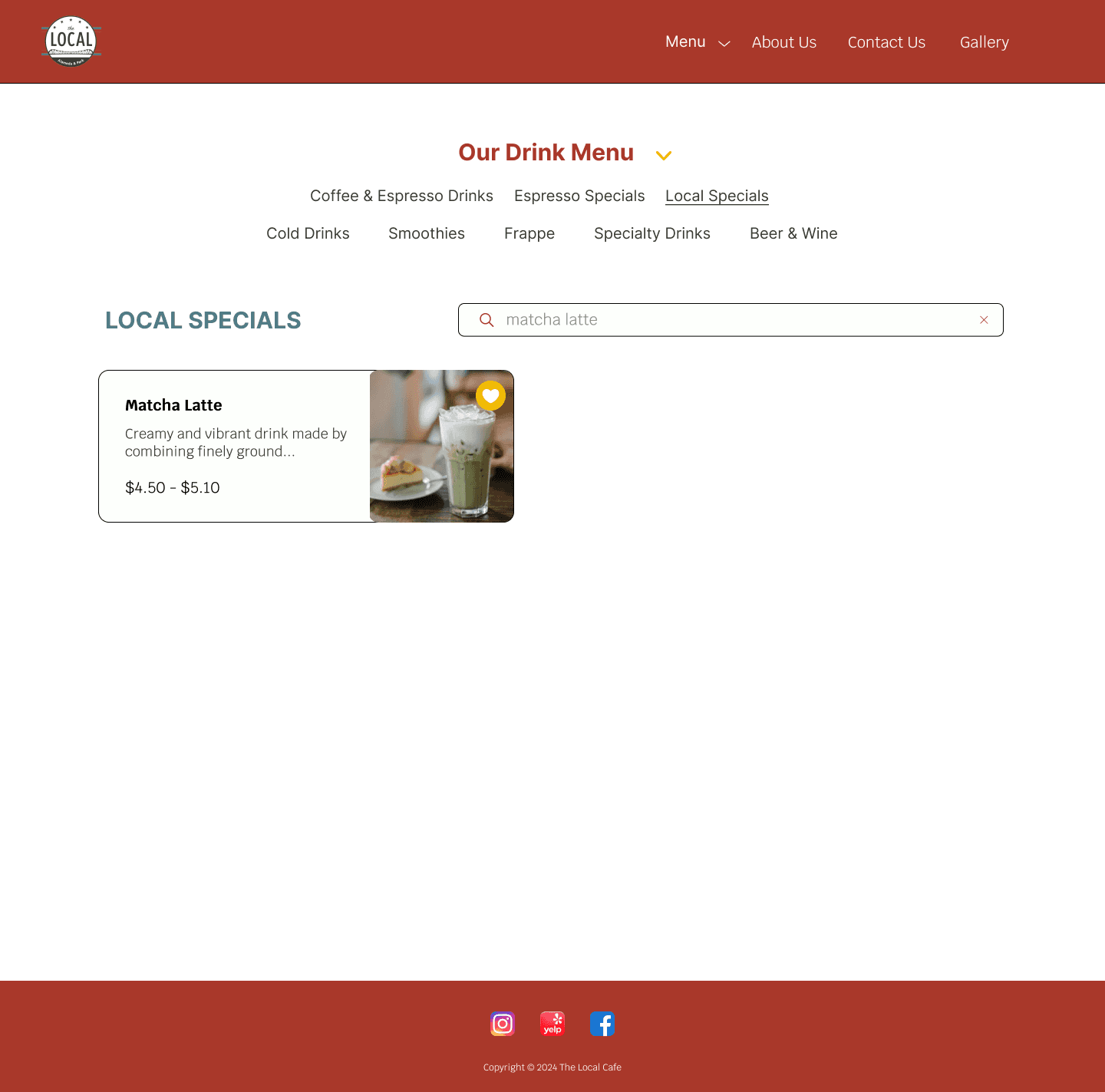
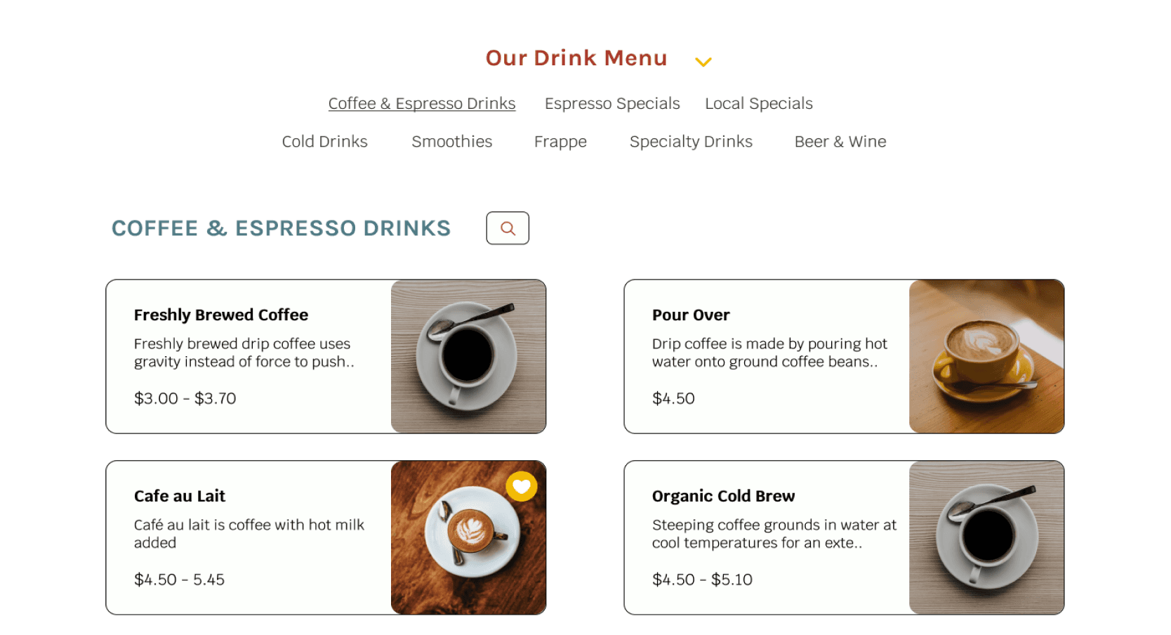
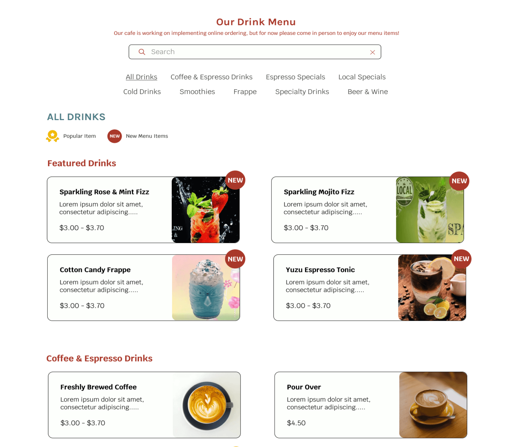
Taking the feedback from my first round of testing, I made the iterations needed and worked to turn my mid-fi wireframes into higher fidelity. As I was making changes, I realized that the website could benefit with a search function, making it easier to look for certain drinks if the customer wants.
Hi-fi Usability Testing
For the first task of my second usability test, I modified the item and asked participants to search for the matcha latte. I reached out to five participants, some of whom had previously participated in my mid-fi testing, and welcomed their feedback.
Goals:
determine if the current layout entices users to scroll more to learn about the cafe
identify if there is anything missing from the current design
identify how users would explain the vibe of the cafe website in their own words
Findings
users suggested adding the substitution & customization info at the bottom of the page along with the individual menu popups
placement of the search bar confused users, making them think they could only search through one category and not entire menu
users described the vibe as “local” and “woody”, felt as if the cafe was welcoming community hub
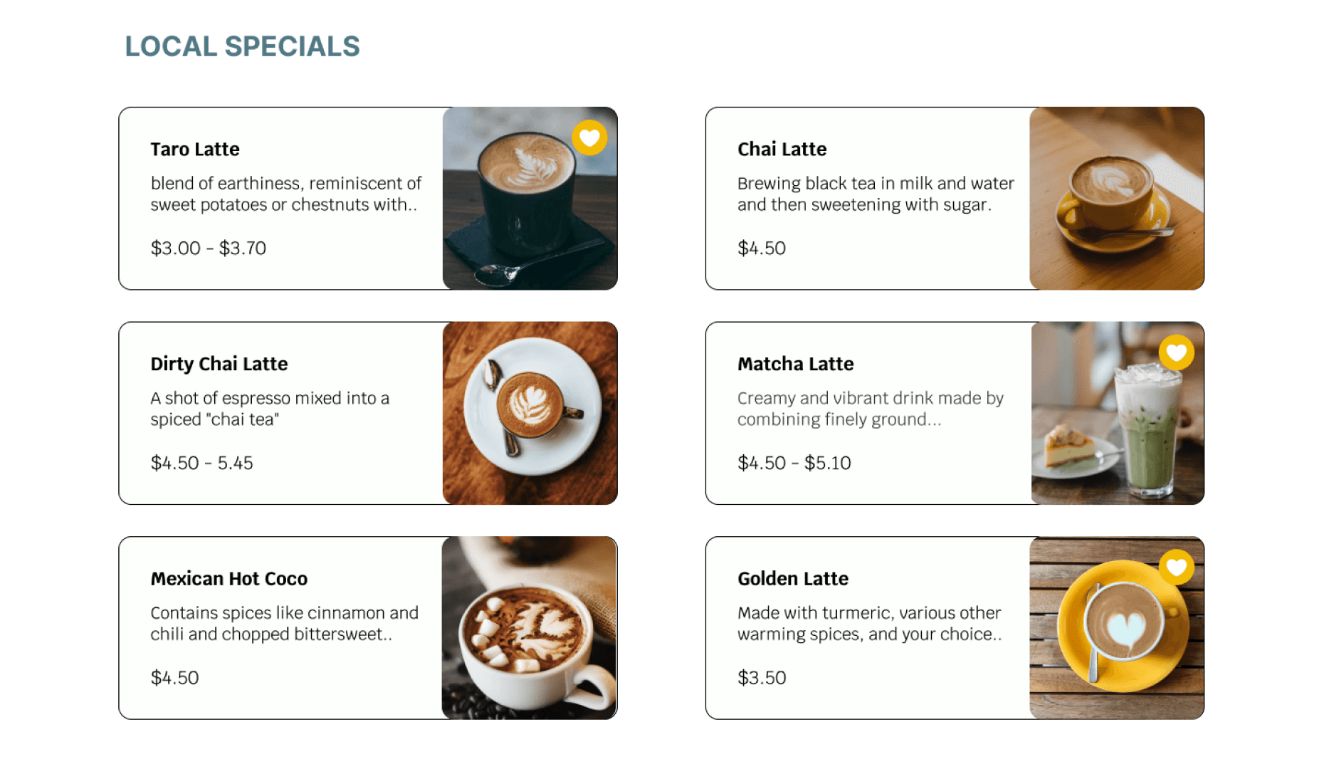
users interpreted the heart next to menu items as an item them favorited
Iterations
Based on the usability results, I refined my design to better meet my user’s needs and expectations. Ensuring to clear up confusions and making sure the product flowed seamlessly.
before
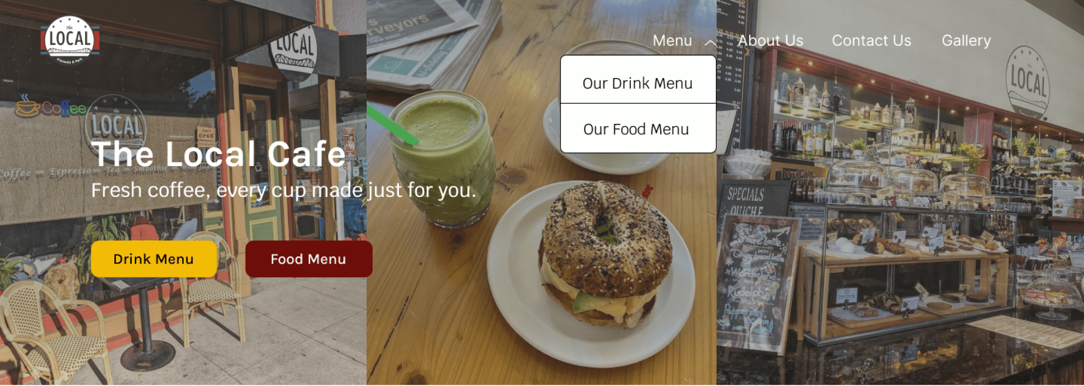
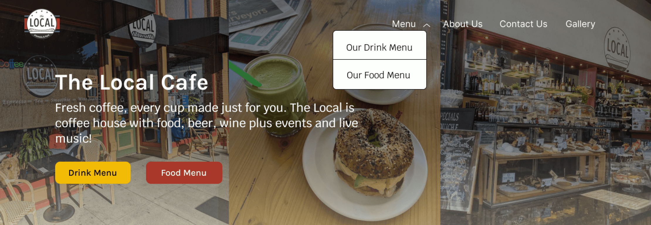
Food menu button was dark and blended in with the background images
Lacked information and context about the cafe.
after
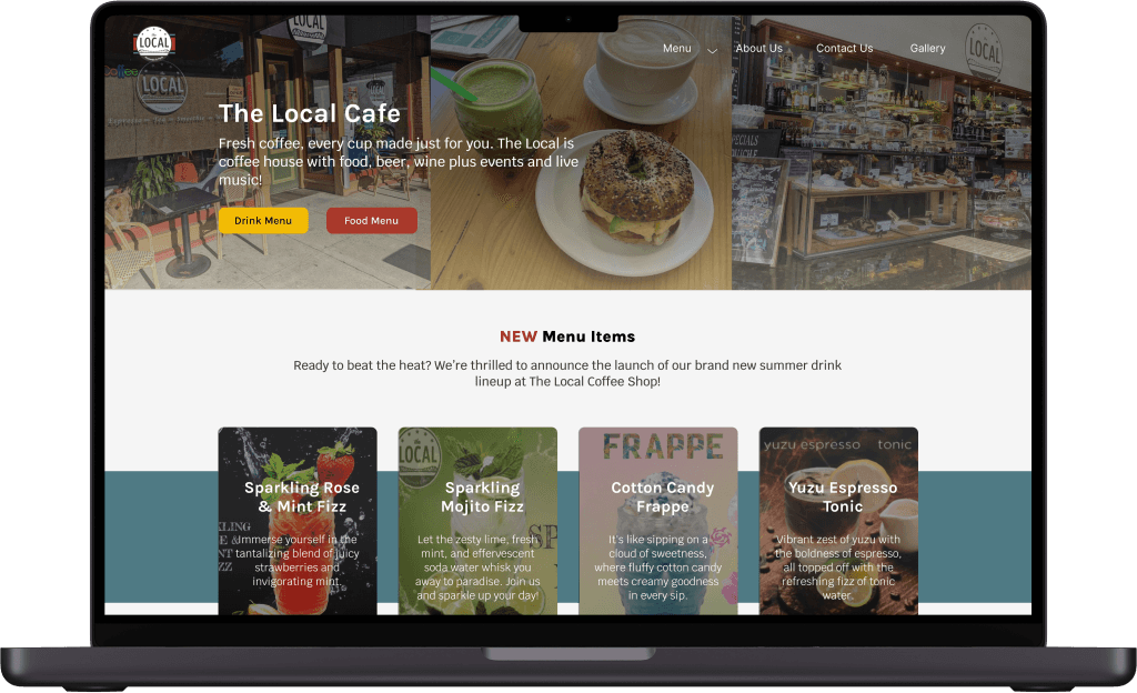
Brightened the food menu button
Added a dark gradient to the background images for improved legibility
Included a brief description of the café to provide more context about what The Local offers.
before
Drop down arrow would allow users to switch between menus
Search bar initially remains collapsed but allows users to search through all drinks.
after
Removed drop down arrow since majority of users thought it was repetitive
Added “Featured Drinks” section and “All Drinks” category
Changed the hierarchy of the search bar leaving it fully expanded
before
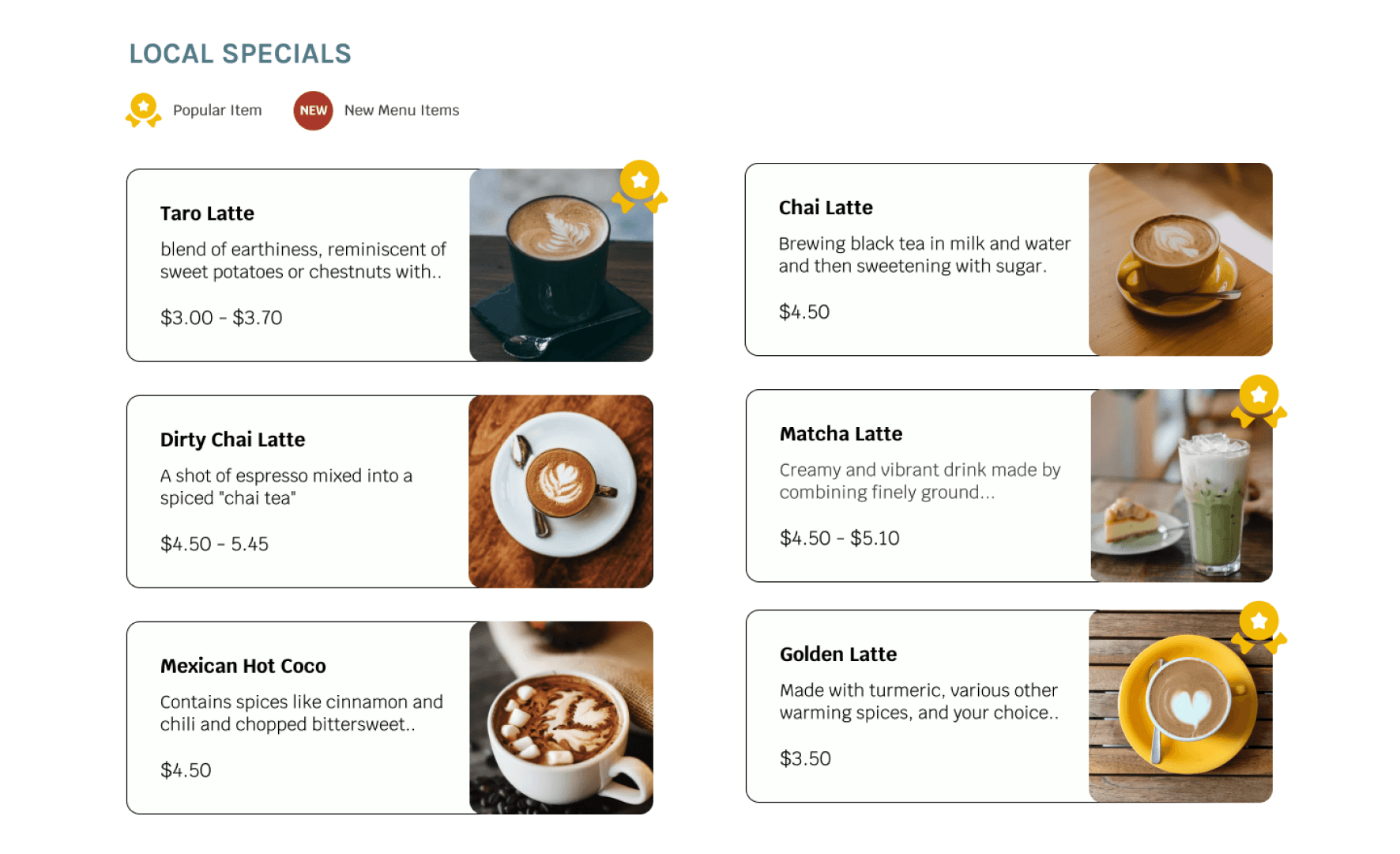
Added a legend to eliminate confusion on icon interpretations
Changed the heart into a badge icon to represent popular items
before
after
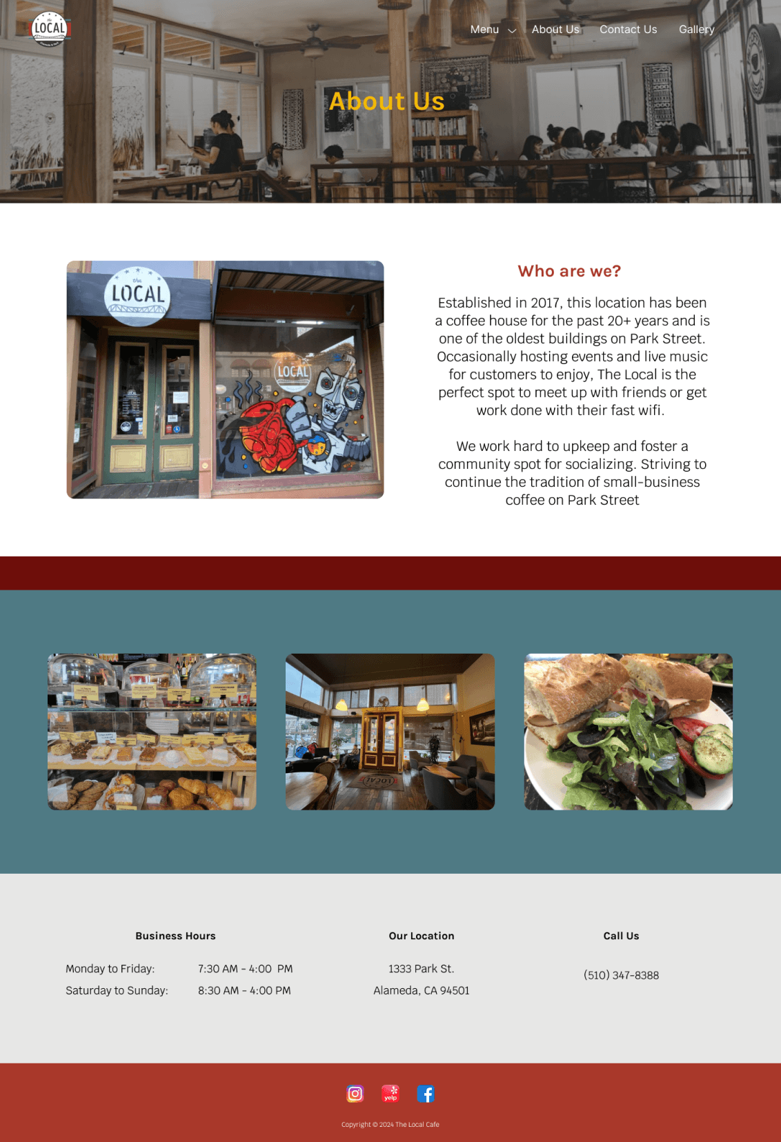
Changed the font color of the “About Us” title and the contact headers to enhance visibility and contrast
Added a map of the cafe location as a visual for users
before
after
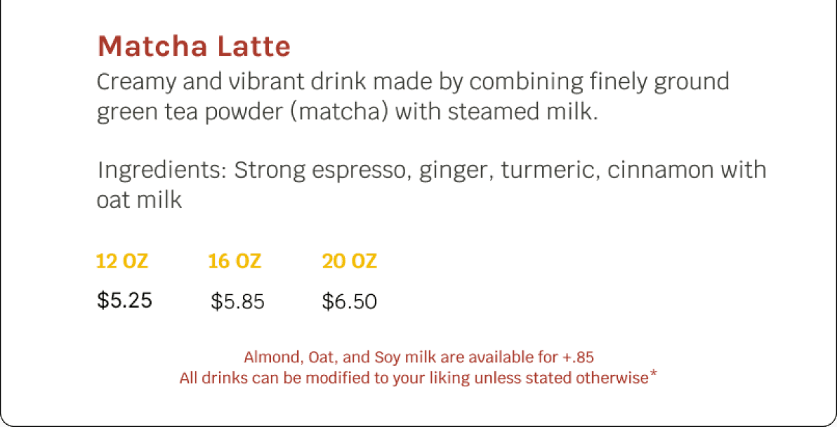
Added text on the drink pop-up showing customers the customizations that can do and the prices
new!
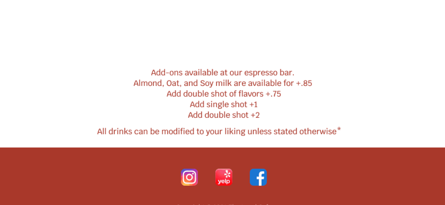
Added the same customizations and price list but on the bottom of the menu pages. This way the info is always displayed for the customer
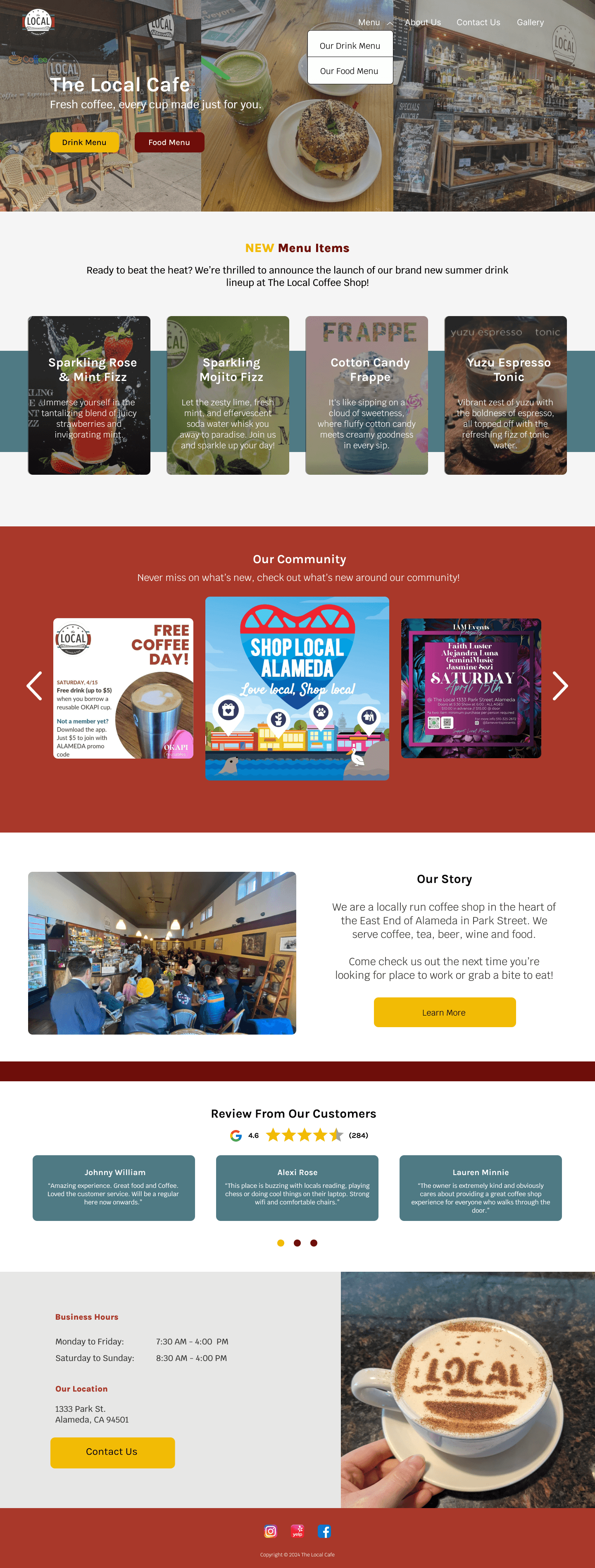
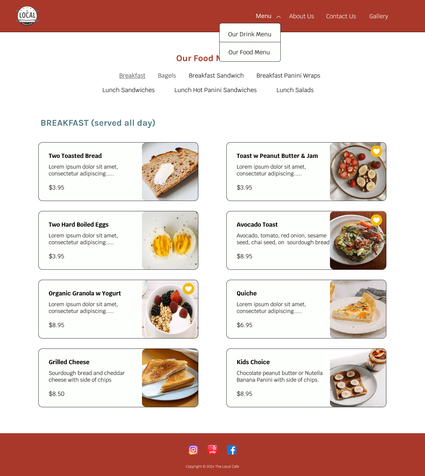
The Final Design
Reflections
I chose to design a website for a small business in my hometown, giving them a place to consolidate all their information in one place. This project gave me a look into how designing within an existing brand identity and aesthetic would be like. Since I didn't collaborate directly with the business owner, I had to rely on available resources to move the project forward.
Challenges:
It was a challenge finding up-to-date information about the The Local to use for descriptions, the about us page, and menu items. As for finding high quality images, I ended up pulling photos from the café’s socials and also customers across Yelp, Instagram, and Facebook. I also had to assume the owner’s business goals and was worried that my designs wouldn’t accurately reflect what they wanted. Talking to potential customers and reflecting back on my research kept me grounded in my design choices, giving me the confidence to keep going.
Future Iterations:
Adding even more personality to the website with a staff page and provide more information on community events happening in the area.
Implementing an online ordering system
